Decorating Do’s and Don’ts
Top design do’s and don’ts to instantly refresh your space.
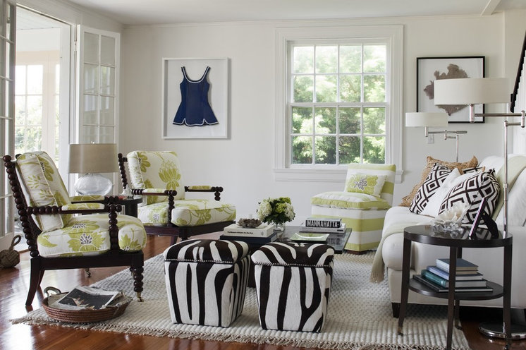
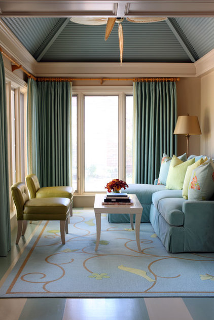
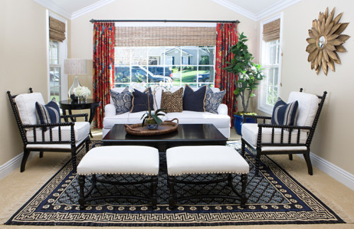
1. Don’t push the furniture against the wall. You will have a much more interesting space if you allow breathing room around your pieces of furniture, as we see here. Allow the furniture to float in the room, away from the walls. This will help create a conversation grouping. The optimal distance for conversational seating is 4 to 8 feet. This is the Goldilocks zone.
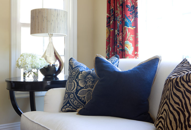
2. Don’t buy small, cheap throw pillows with solid forms. Pillows should be generous, overstuffed and formable, like these. Use soft, plush, down-filled pillows that can take a shape. There are great synthetic fill options, too. Use the classic “designer’s chop” to determine if they will shape up: a quick karate chop to the top edge to break up the pillow’s blockiness.
3. Do choose the PERFECT paint color.Paint color makes or breaks the look of a room. If it’s poorly matched, the result will be weak at best. It takes experience and a trained eye to correctly read undertones. Consult a pro on this one to set your results ahead of the crowd.
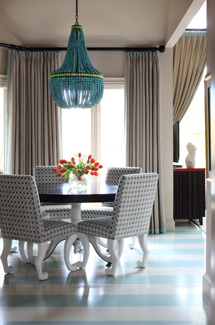
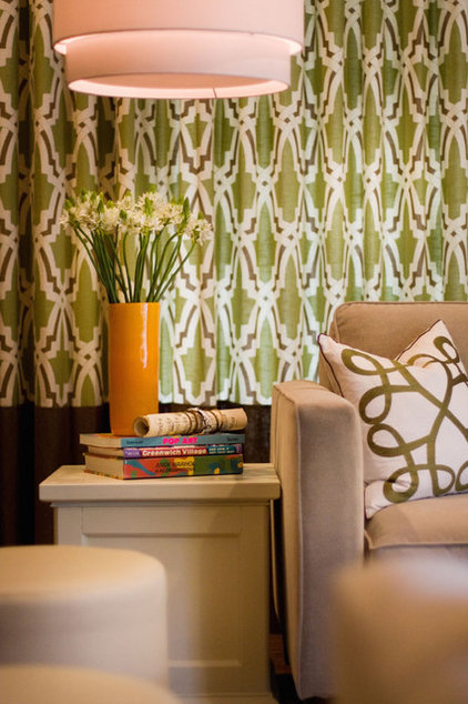
4. Don’t Skimp on Lighting. Use appropriately scaled, relevant lighting. Lighting, more than any other element, asserts style, much like a chosen piece of jewelry defines the style of a little black dress. Don’t be afraid to inject personality with a statement piece.
5. Do splurge on an area rug size. An area rug defines a grouping of furniture. Buy one large enough to lie under at least the front legs of each piece of furniture in your grouping.
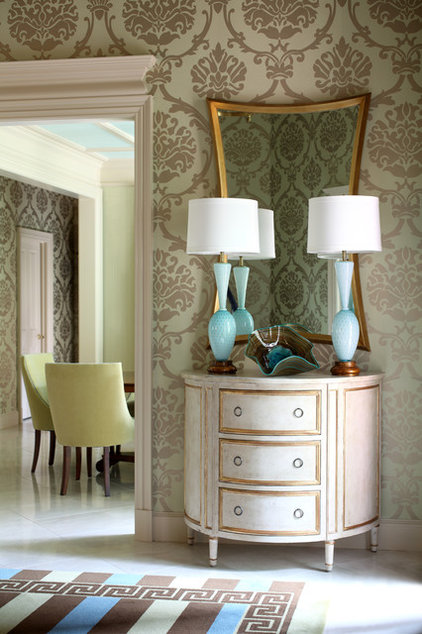
6. Do link adjacent spaces. Create flow from one room to the next by repeating a pattern or carry an accent color or another visual element (such as a leg detaiI) from one room to another.
7. Don’t skimp on drapery. More is more in this department. Professionals use fabric yardage that’s two and a half to three times the width of the window for fully functional drapes. With fixed side panels (for show only), you can get away with fabric twice as wide as the window. Don’t skimp.
8. Don’t overly matchy. Don’t match textiles and furniture — relate them. A designer’s task is to create a collected look. Look for a collection of pieces with something in common, such as style, motif, color, history, material or mood.
9. Do remember the details that make a piece special.
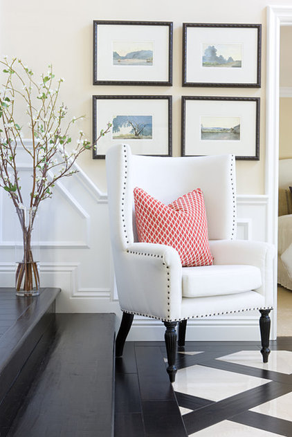
Once you train your eye to notice the details, you’ll see that a chair with a beautiful turned leg carved by a skilled craftsperson is different than a mass-produced machine-made piece. Custom details are evident in professional work. Contrast piecing or piping on a pillow, or welting, nailheads or trim on a chair. Details, details, details make the result special.
Once you train your eye to notice the details, you’ll see that a chair with a beautiful turned leg carved by a skilled craftsperson is different than a mass-produced machine-made piece. Custom details are evident in professional work. Contrast piecing or piping on a pillow, or welting, nailheads or trim on a chair. Details, details, details make the result special.
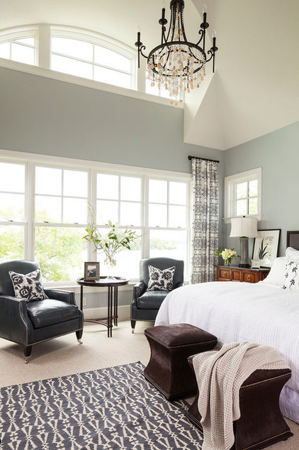
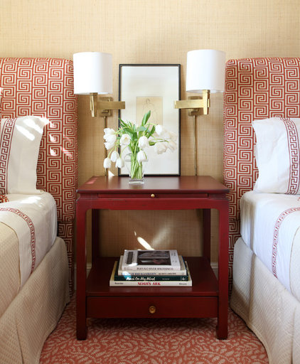
10. Do layer. Designers use layering and repetition of elements and motifs to achieve a professional look. Most people get the concept of layering when it comes to fashion. In design it isn’t much different. Pick something you love, like this patterned headboard, then repeat the color or the pattern.The artistry lies in stopping before the look becomes too matchy (it always helps to toss in something unexpected to achieve this). Subtlety is key. Drapery, wallpaper, pillows, throws, bedding, accessories — all are great options for layering in a bedroom. You be the judge as to how much is enough.

